

New
PhoHolic
PhoHolic is a Vietnamese noodle shop located in the heart of Orange County, California known for serving authentic Vietnamese pho that warms both the body and soul. With a menu featuring a variety of savory broths, fresh herbs, and tender meats, PhoHolic offers a culinary experience that transports diners to the bustling streets of Hanoi. Customers rave about the flavorful broth and the affordable prices, making it a favorite spot for many pho enthusiasts.
Concept Project - Menu Redesign
Duration - 1 Week
Tools - Figma, Adobe Illustrator, Procreate, Google Suite
Role - Design Lead
Objective:
The primary goal for this redesign is to improve readability, enhance customer experience, and provide visual brand identity.
Branding:
PhoHolic is a Vietnamese owned restaurant that specializes in transporting flavors of pho from Vietnam to Southern California.

Next Steps:
Old

The primary colors for their logo is red and yellow. The colors play an important role because they symbolize the Vietnam flag and the history during the Vietnam War. Red as the primary color is key because it also represents prosperity and good fortune in Vietnamese culture. For this redesign, I wanted to incorporate a character that represent a consumer of pho. Their restaurant name is PhoHolic which translate to someone who is addicted to pho.
Colors:
Typography:
Aa
Poppins - Accent Text
Current Menu:
Menu Redesign:
Aa
Poppins - Main Text

PhoHolic’s current menu separates the different bowls of pho into three categories: the beginner, the adventure’s and the holic. Each level represents the customers’ experiences with pho as well as their efforts in expanding their taste palette. Pho includes many different types of ingredients which may seem new or odd to some. The three categories make it easy for new and returning customers on deciding which pho to order.
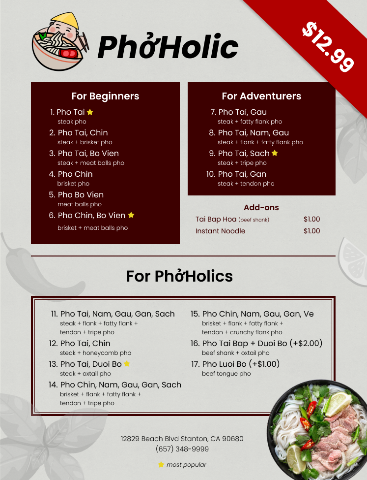
One of my main goals is to keep the three categories for pho. I changed the wording by using “for” to indicate which type of customer may fall under. The visual hierarchy follows a top-down approach so that the exotic types of pho will be read last. Additionally, I improved “adventure’s” to “adventurers” to be a noun that customers may relate to. Most of the pho are priced equally at $12.99, unless stated otherwise, so I chose to omit the prices and instead include 1 price that is sized largely to minimize price sensitivity. Moreover, I added a star with a legend indicating the most popular pho that is ordered at the restaurant. There are a total of 17 different pho that PhoHolic offers and it may be overwhelming to new customers. I applied Hick’s Law in order to reduce the amount of time a customer takes to order due to the number and complexity of choices.
This concept project revealed the importance of visual hierarchy and readability. In a menu, it is key to emphasize through font size, color, and placement to ensure readability with clear, concise descriptions in order to enhance the customer experience and guide their choices.
Some next steps that I would like to conduct for this project incorporating customer feedback with the menu redesign. Then, collecting the feedback to improve and reiterate the menu design. I would also like to include a front cover page of the menu displaying more of the restaurant’s brand identity and short information of the history of PhoHolic.